New brick: Icon Box
Create a new brick / control: Icon Box. Please consider QUI\Bricks\Controls\BoxContentAdvanced. This control is a good starting point. This has almost the same functionality, but is a bit crowded. The new one is to limit and specialize in icons. This means that images should also be selected (e.g. SVG icons). So it is not only about FontAwesome icons.
This control should provide following settings:
-
Center content -
Template (select) - for now only one template should be available -
Entries per line (2, 3, 4, 5, 6). More ist not necessary. -
Icon size. I'm not really sure, how to treat this option. We have both icons and images. Maybe separate setting for this two? -
FontAwesome icon size: (select) small / medium / large -
Image icon size: (input type number). This will set width and height html attribute.
-
-
NEW! Content position --> select box, possible options: - default (above content, works like any other brick)
- left: image example
- right: example here: https://www.ecoyn.de/Partner
Entry settings:
-
Icon / Image -
Title -
entryContent (do not name it content).
Ideas:

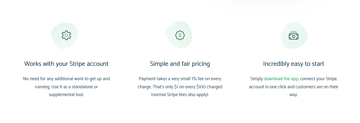
Source: https://paymentforstripe.com/
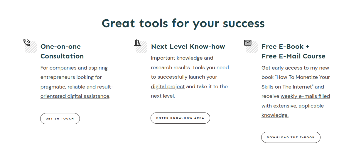
Source: https://andreasschrade.com/
von Dominik Chrzanowski bearbeitet